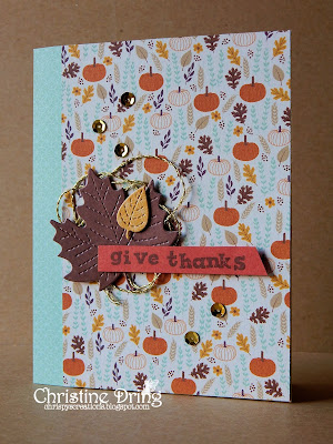
Hello and welcome! This week at SHOPPING OUR STASH we are giving thanks, whether it be for the US Thanksgiving coming up or just a thank you to a friend or family member, we want to see it! Here's the card I made:
and the inside:
I don't seem to have a stamp that says 'give thanks' so I used alpha stamps. (That's why it looks so wonky) I do have to admit that the papers I used are from a new collection I purchased last month, but everything else I used I've had for at least a year or more. ☺
I hope you get the chance to play along at Shopping Our Stash this week. We look forward to seeing your project in the gallery! Please do check out what my teammies created to inspire you and leave them some love on their blogs. Thanks for stopping in, and I hope you have a great day!
Supplies:
Stamps: Studio G alphas; Hero Arts - Celebrated Everyday
Ink: Memento - Rich Cocoa
DP: DCWV - Harvest House
CS: Darice
Accessories: GC; Lawn Fawn - leaves dies; DMC - gold floss; Nicole - sequins
Adhesives: SA by 3L - thin 3D foam squares, tape runner; Ranger - Glossy Accents; Glue Dots


LOVE the colors in the paper. That light blue is awesome!
ReplyDeleteI too loved the colours in the paper and fabulous use of the maple leaf and the twine. Great use of the sketch.
ReplyDeleteok, see, i TOTALLY thought that "give thanks" was one stamp and i was admiring the perfection of its adorably purposeful wonkiness!!! (wonkity? wonkstrosness? what's the noun of wonky????!?!) and yes, i do lOVE that leafy paper! and the leafy diecuts... and the little bit of twine or... suuuuper thinly diecut paper... that looks a bit like a wreath behind the focal? to sum up: YOWZA! ♥
ReplyDeleteNo this is a perfect example of how amazing clustering can work! As for the wonkiness - I think it's part of the charm of the card! Haphazardly gorgeous!
ReplyDeleteThis is wonderful! I love the composition of your focal grouping because it appears that you are highlighting one of the elements in your paper! The "wonky" letters are perfect and would not have the same graphic impact if they were straight! Wonderful project, beautifully composed and executed!
ReplyDeleteHugz,
Chana
Gorgeous thanksgiving colours and a striking elegant card!
ReplyDeleteThanks so much for linking up and playing along at AAA Cards.
Sarah x
This is beautiful, Chris. I love your use of patterned paper, both on the front and inside of the card. The stitched leaves are adorable! Thanks for joining in the fun at Just Add Ink this week.
ReplyDeleteThe solid die cut leaves (love the vein details) is the perfect contrast to the cute busy DSP Chris. Such lovely warm colours too! Thanks for joining us at Just Add Ink this week.
ReplyDeleteI love this, Chris! So beautiful! Pretty paper and I really love your wonky sentiment stamping! The leaves and twine and sequins are so elegant and pretty, too! Love it!
ReplyDeleteJust love that background paper you used, the pattern is fantastic and love all those little images. Fabulous use of the sketch too with those die-cut leaves. So very glad you joined us at Just Add Ink this week!!
ReplyDeleteooh, I LOVED the wonky sentiment! Would never have guessed that it wasn't one stamp as it looks so perfectly wonky. Thanks for sharing your card with us at Just Add Ink.
ReplyDeleteVery pretty patterned paper - absolutely perfect for a Thanksgiving card! Thanks so much for playing along with us at AAA Cards! Jill
ReplyDeleteI love the wonky "give thanks" it's fantastic!!!
ReplyDeleteLove the pretty papers and the wee sequin accents! Great job!
That's freaking gorgeous!!! I love the gold cording behind the leaves - and the slight wonkiness is perfect for that font!
ReplyDelete